SZ
DURATION
2 Months
ROLE
Concept, Visual, Group
OVERVIEW
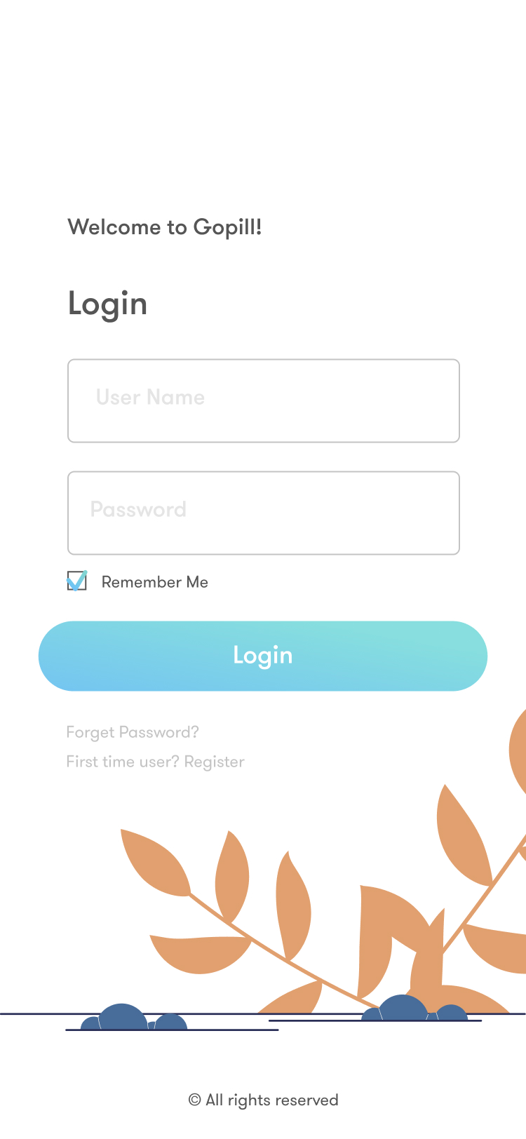
GoPill is a mobile-first application that connects the patient and doctors through providing a safe, intuitive management system. It allows patients to make appointments effortlessly, manage prescription, consult problems with the doctor as well as check out the nearest pharmacy.
00 Problem
With the booming economy, people are paying more attention to personal health care. But making appointments with hospitals takes a lot of time. Compare to the fast delivery services in transportation and catering industry. A new medical system is needed to feed this enormous health care market.
A medical system that promotes and maintains engagement through an interactive and authentic experience, simplifying the medical process.

01 Timeline

Understand
Interview,
field research

Empathy
user flow,
user case,
persona

Decide
a/b test,
card sort,
information architecture

Prototype
Low-fi Wireframes,
usability test,
design interfaces,
motion design

Visual
Branding,
design guidelines
02 User Survey
Andy and I conducted a user survey, evaluating and interviewing 10 individuals within our target demographic of 18–50 year olds on their medical habits and preferences. We discovered that there are three key areas they are most care about:
On Connection
Patients are always scared of the complicated process of making doctor appointments. They may end up buying a substitute medicine in a pharmacy or doing nothing.
On Continuity
We found out patients care a lot about information safety and continuity when they switch hospitals, doctors or insurance companies.
On Professionalism
Patients have eager to understand the complete information of the medicine and their prescription. And because they only connect with a doctor in the hospital. It takes a lot of time to research the medication.
03 Literature Research
“How digital technologies can change hospitals globally”
Before diving into an actural solution, it is necessary to see how professional field imagine the future of medical service. I did literature research and held a discussion with my Andy on this the following papers:
04 Goals
Easily understand the process
Structure introduction in a way that shows the process in a way that intuitive, easily understood.
Organized prescriptions
Patients have eager to understand the complete information of the medicine and their prescription. And because they only connect with a doctor in the hospital. It takes a lot of time to research the medication.
Directly connect patient with doctor
Enable users to consult with doctor directly, ask questions when they need some help.
07 Decision
We considered various features and flows in creating an experience that would match our goals and the client’s goals. We then use card sort method to decide the basic structure of the application. Also, use A/B test to determine the basic interface layout.


We used paper preliminary wireframe and digital printed wireframe for two rounds of design test, then get usability results from them:
1. Text sending button
2. What if the patients want to make appointments with specific doctors?
3. Time slot of the doctors
4.Add the a new case from the patient’s end
5. Appointment Confirm Page
6. If there is no prescription


Based on the feedback from the paper-testing, I start the a round of A/B testing.
The purpose is to find out which way of showing product information is more efficient and user-friendly. I recruited the participants through social media sites and most of them are volunteers. I showed them these two different designs and let them try out both prototypes. It was surprising that most users prefer Design A. Since before the testing I personally thought that the Design B might be the winner.

09 Design
After an extensive wire-framing process, we went to visual design stage, implementing the chosen mood and style to the blueprints.

Reminder
Users can view their medication schedule, the small dots underneath present the different pills on that day.
Switch to list view
If there is not a lot of daily schedule of medication, the list view is a more effective way to view the medication plan.
Daily plan
The section underneath the calendar shows the daily medication plan. It will default show today’s medication plan. But if the user clicks on the day on the calendar. It will show the plan on that day.


Appointment List:
The patients can manage the existing appointment as well as add one.
Appointment Detail:
On appointment detail page, patients can check location, doctor's information, and address.


Main Menu
Users can always check the calendar, active prescription, and history.
Brief Doctor Profile Professional doctor picture and title make it more authentic.
Text Field
The patient can always text the doctor whenever they have questions about the medicine.
History section
GoPill put patients prescription history in the third main function. They can also check their medicine history.


Empty page
For most of the time, people don’t have medicine plans and prescriptions, So they will receive a congratulation message.
Bold Mode
The users with vision problems can always switch to the Bold Mode, to make everything bigger on page.


Medicine Image
There is a visual image of the medicine.
Review and side effect section
Use small sections to divide the review, side effects and dosage section. Make the huge amount of information more digestable.


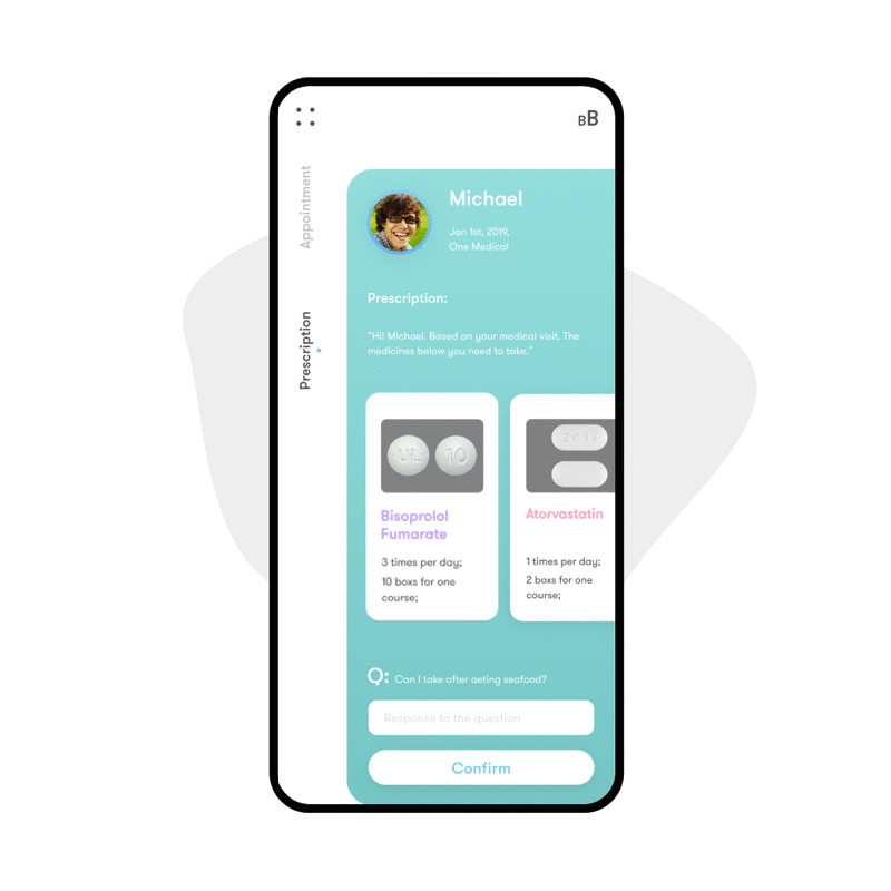
Active Prescription
The Active Prescription section is a collection of the recent active prescription. Doctors can view the detail information inside and respond to patients’ questions.
History
Doctor’s prescription history collects the prescripts that he gave before.


My account
The users can manage their personal information on the top left icon.


10 MOTION

Interactive Introduction
To help patients quickly understand how GOPILL works in this triangular system(Doctor, Pharmacy and Patients), an interactive introduction with illustration can be an answer.
List View Medicine Reminder
The patients can always view their daily medicine plans on reminder section. The different color dots represent different medicine.

Prescription
Patients can access their doctor's medical advice directly from GOPILL.
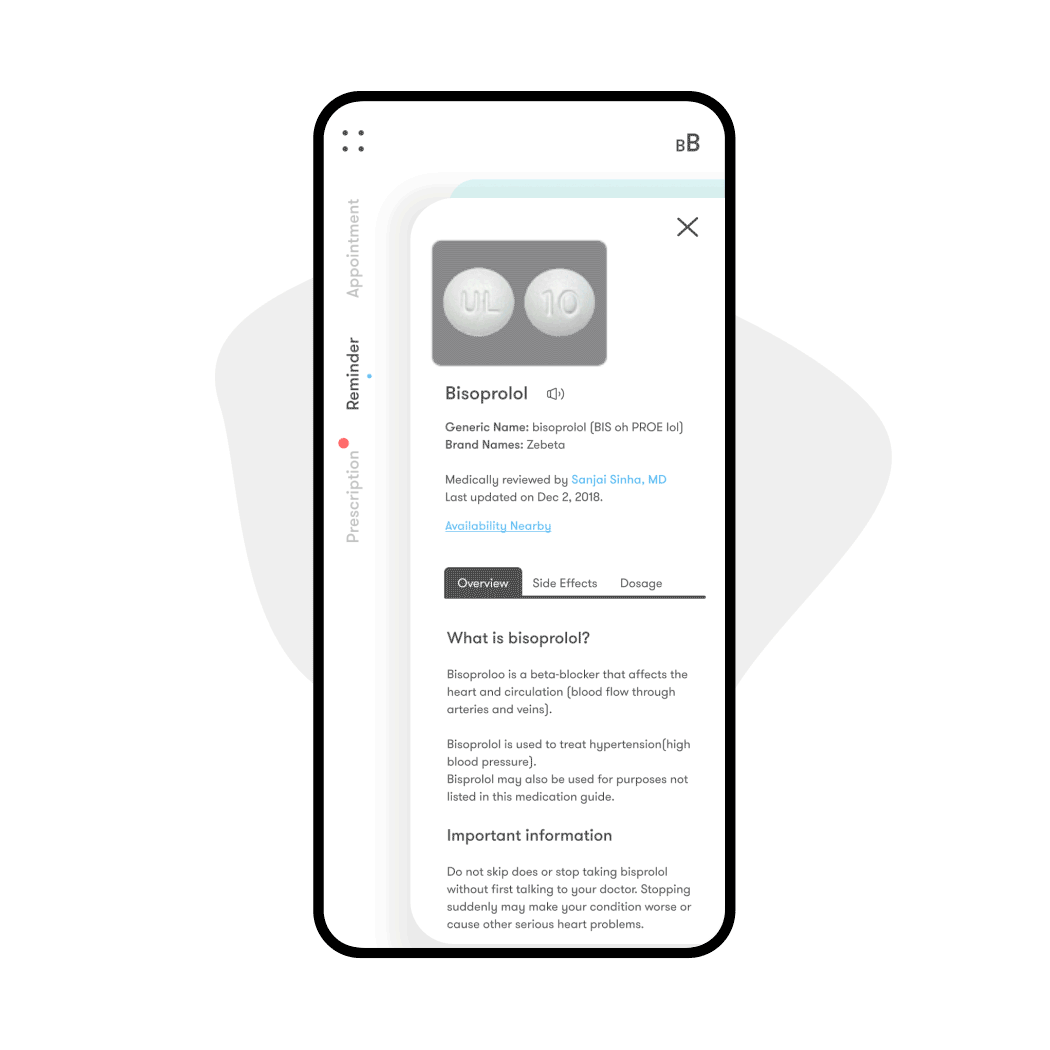
Nearby Pharmacy
On the Medicine Detail page, the users can see where this medicine available near him.
11 Interactive Prototype